Thanks @JoshFossgreen for just doing this! And a massive thank you to @mediaklan for the artistry and creativity, you guys made me smile!
2 Likes
Thank you @eric.kiser @antonio
Since I have no experience doing emoji/emoticons, it could have probably be done better but I’m happy if you find these ![]()
![]() useful ^^
useful ^^
6 Likes
Maybe this ( for inspiration).
This is not mine and I can’t recall where I found it but I think it’s pretty awesome.

I searched and found the source. ![]()
From the No Treble magazine merch store.
3 Likes
It looks familiar ![]()
I stole it from Kurosawa Music.
6 Likes
![]() Very cool @mediaklan
Very cool @mediaklan ![]()
I hope seeing these in the future doesn’t trigger memories of being turned inside out on your sick day. ![]()
2 Likes
#thesadfateoftheflyingbass
12 Likes
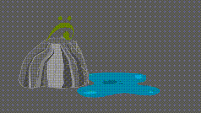
Good lord. That’s mesmerizing.
Look away people! Look. Away.
I’ve watched that green bass monster eat that little BassBuzzBugBass a hundred times.
3 Likes
![]()
And each time we hope for a different ending … to no avail ^^
3 Likes
This is brilliant ![]()
1 Like
And so it is done! ![]() I think it looks good even scaled down.
I think it looks good even scaled down.
Code is : clef :
Weird thing - I’m noticing since I’ve added custom emojis all inline emojis are displaying way below the text center line, like ![]() , is anyone else seeing that?
, is anyone else seeing that?
5 Likes
Yes
3 Likes
I’ve been seeing that some time already, might have a different reason ![]()
1 Like
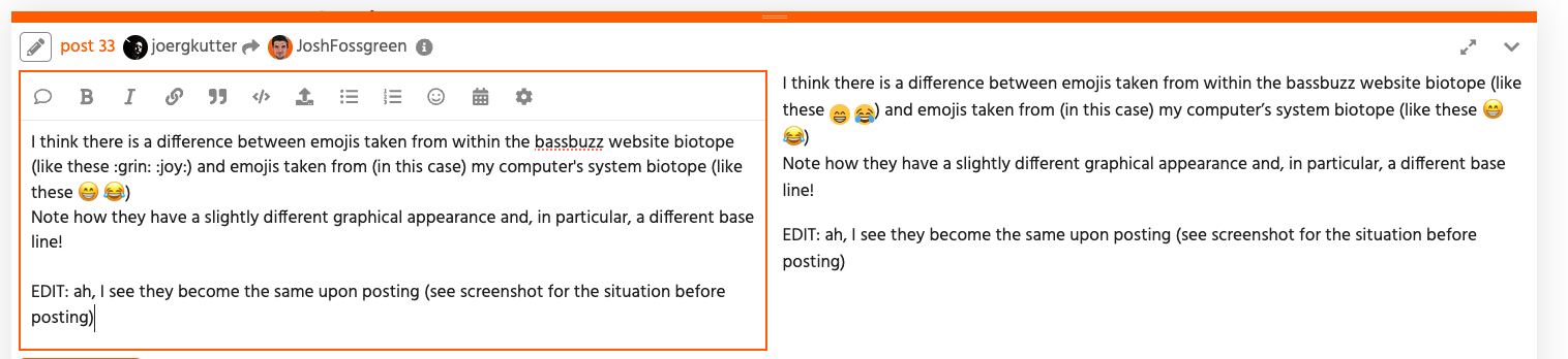
I think there is a difference between emojis taken from within the bassbuzz website biotope (like these ![]()
![]() ) and emojis taken from (in this case) my computer’s system biotope (like these
) and emojis taken from (in this case) my computer’s system biotope (like these ![]()
![]() )
)
Note how they have a slightly different graphical appearance and, in particular, a different base line!
EDIT: ah, I see they become the same upon posting (see screenshot for the situation before posting)
1 Like
I think this indeed refers to the “ligne de base” (in french) from typography and font design. This baseline serves as one reference point among others like the “ligne de jambage” (no idea how this is called in english) for “p”, “g”, <find-the-next-character> … ^^
Since there are different rendering mechanisms among platforms (discourse, safari, firefox, windows, linux you name it), devs will compensate with an almost sure value to ensure consistency. And so all hell breaks loose. Or almost that.
(please note that I will deny responsability if this is not the reason why emojis are aligned in a certain way for a specific font/platform/whatever)
3 Likes
I had noticed that as well, but it seems to be fixed now? Probably due to a forum software update.
2 Likes
New profile pic, @Mike_NL ? Looks very Dutch ![]()
![]()
2 Likes
You know it! ![]()
![]()
![]()
3 Likes
It’s because Orange is the best colour EVER ![]()
4 Likes
I disagree : #ff6600 is the best colour.
2 Likes
I totally love how the emojis in this forum are “in the bassline” of the typed text. ![]()
![]() It feels absolutely right that they show up way below the text center line.
It feels absolutely right that they show up way below the text center line.
3 Likes