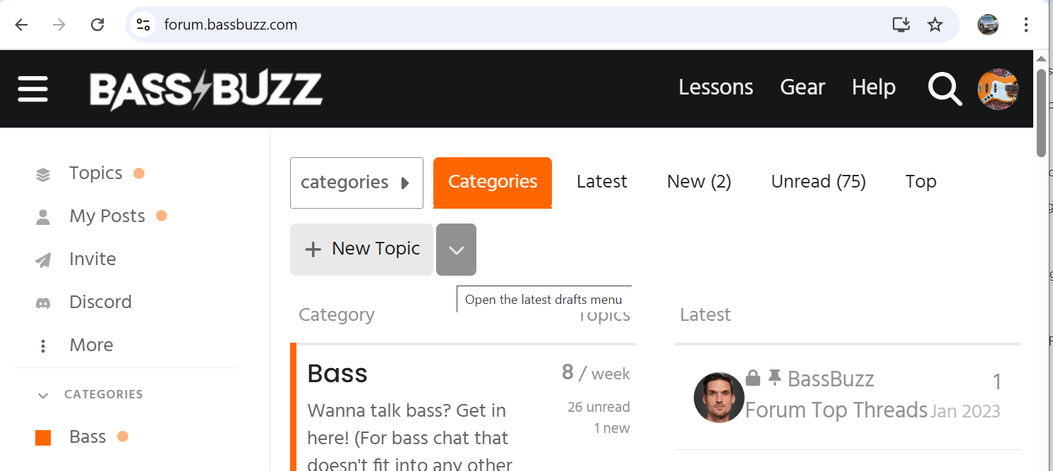
The forum page has - at least for me - undergone some stylistic changes in the past two weeks or so… and not all of them really for the better (IMHO). Has anybody else noticed?
Perhaps I should stay quiet and let people who have an understanding of graphic design chime in (@MikeC , @mgoldst , …), but that logo alone doesn’t come across as a professional job to me; e.g., the way the letters are sometimes behind, sometimes in front of each other. Also, that flash symbol looks super wimpy now… like it’s about to fade away. Shouldn’t it be orange at minimum?! And larger!?
OK, sorry for the Sunday afternoon rant here… I need some coffee (PS: despite my criticism, I am still very grateful that @JoshFossgreen lets me hang out here for free!!)
I did notice the new BassBuzz logotype. Objectively, it’s not an improvement versus the original design. To be clearer, it is definitely not great.
The original design was bold, authoritative. The new one seems to be striving to be…edgy, maybe? Honestly, the design logic is a mystery. And, from a communication standpoint for what was an established brand, that ain’t good.
Additionally, in the forum page’s portrait responsive layout, i.e., mobile phone, the BassBuzz logotype shrinks to teeny-tiny. This is clearly an error that’s not difficult to fix. The forum developer can easily squash this bug.
I don’t mean to cast stones, @JoshFossgreen, but these are legit design/development issues that need addressing, especially for a beloved and ever-expanding brand that is BassBuzz.
I think that there are two things to talk about here, 1: the actual design of the new logotype, and 2: the implementation of the new logotype.
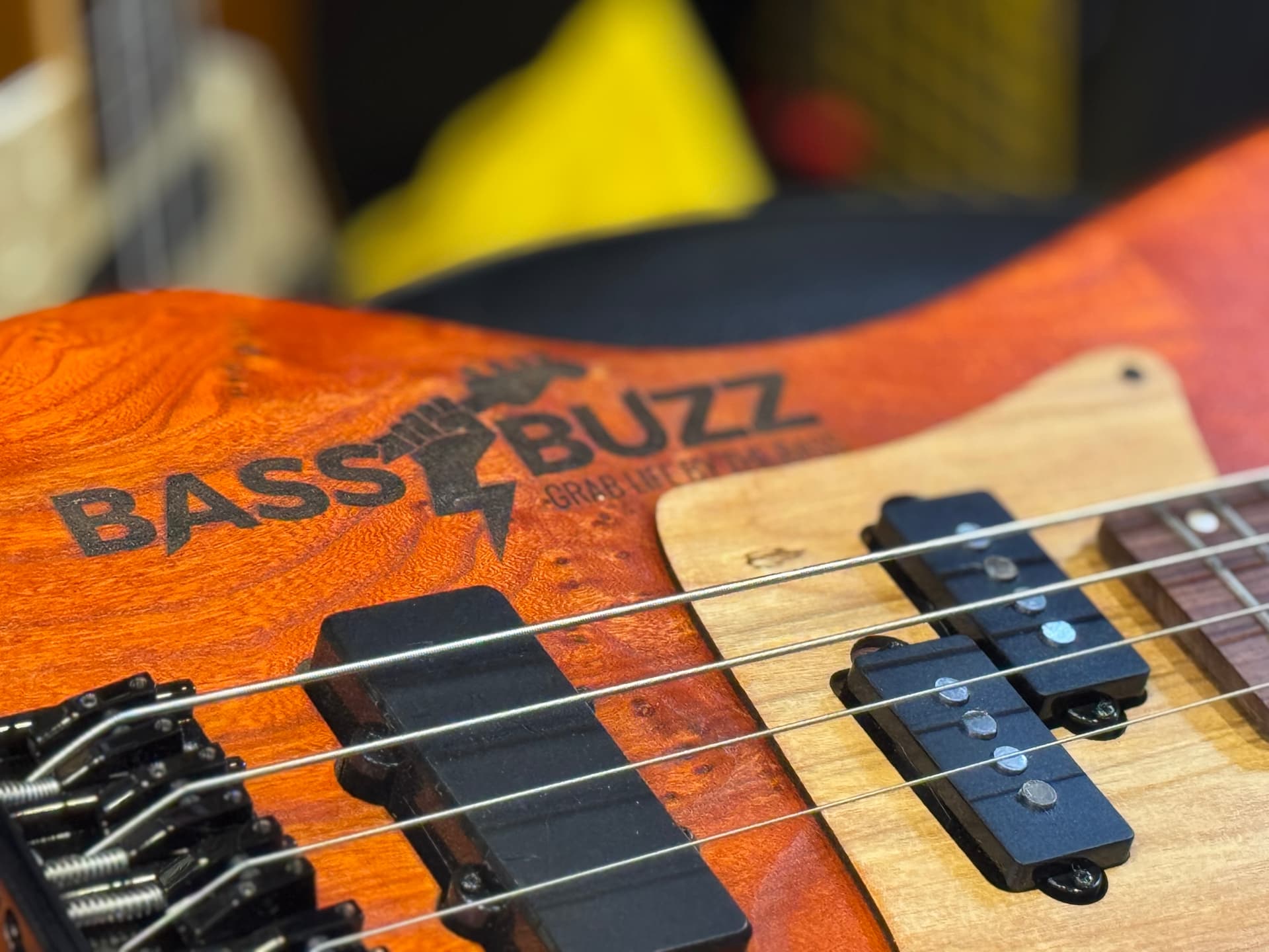
Starting #2 first, it seems to me that the rendering of the PNG is a little off, the logo looks a little fuzzy, possibly not sized correctly, etc… I think it’s just maybe a little bit technically not quite rendered or possibly drawn/constructed correctly but this is easy to fix with a little bit of attention.
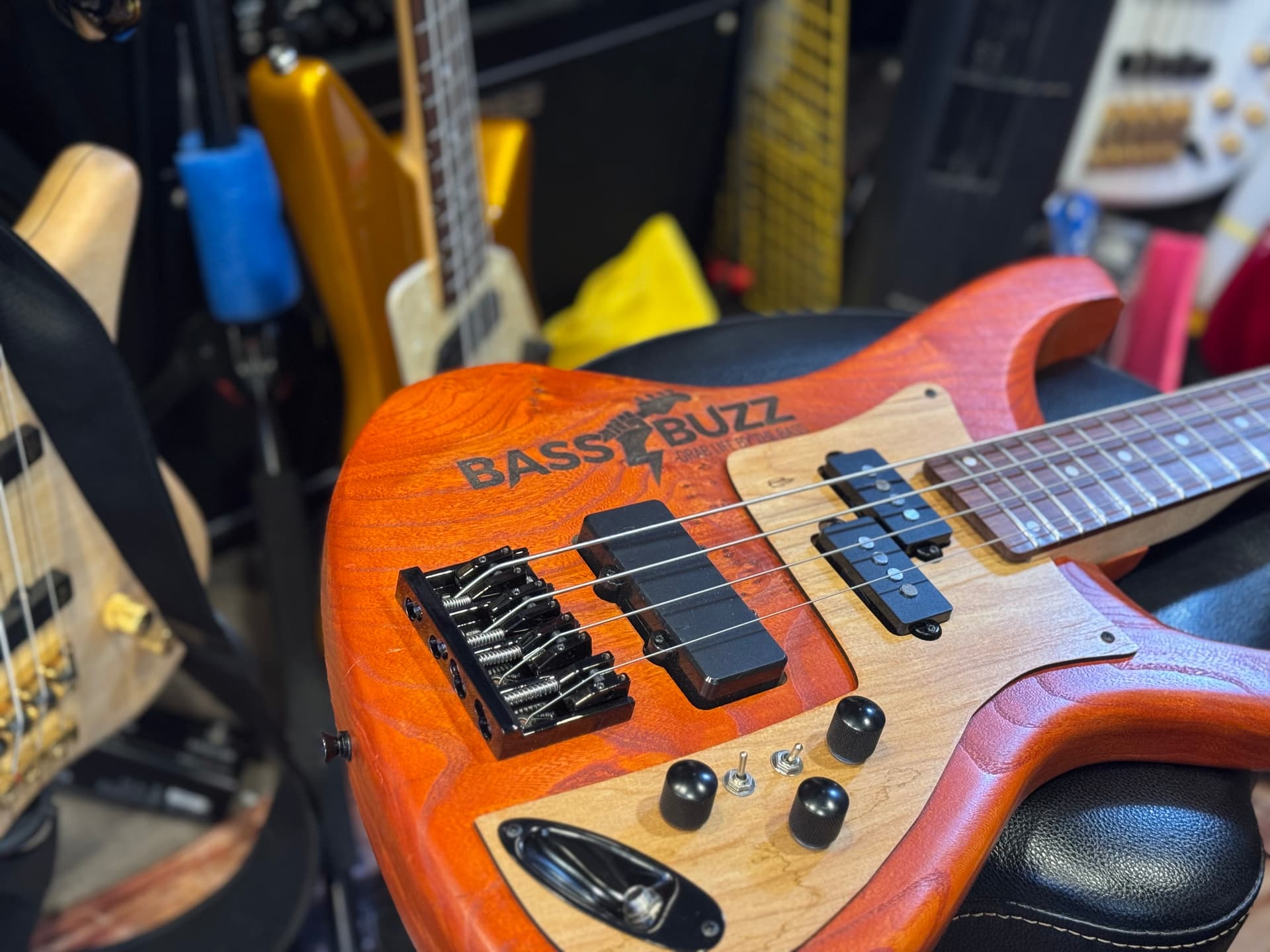
Far more importantly, is #1: the design of the new logo. I personally love what it’s trying to do – a bass forum, where people are learning to play a musical instrument, be creative, have fun, explore their own artistic influences, etc. is no place for a generic, dry, "corporate " looking logo. In this context i would always, always, always, always, prefer a slightly wonky logo that has some personality, than a perfectly executed logo that is ultimately generic (like a majority of what comes out of large branding studios now) that could be for anything – a household product, an investment company, a car brand, etc. To me this logo is a little goofy, a little silly, fun, and perfectly on point for what we are trying to do here.
I hear you about the logotype design, Mitch, but I disagree.
BassBuzz is first and foremost a business. The original logotype was funky in a well-designed way. In my opinion, the new one looks amateurish in comparison.
Certain conventions in logo design exist because they have been proven to work. The most successful project stability, trust, and they promote growth — all necessities for maintaining and expanding a business. YMMV
absolutely NOT — design is not made just for other designers, it is made for everyone. your opinion always counts regardless of your education, background, or anything else. what you (and everyone else) think about a piece of design always matters.
To get technical for a moment, any logo used on a website/webapp should be in an SVG format, not a PNG.
An SVG (“Scalable Vector Graphics”) file is infinitely scalable without losing any resolution, so it stays sharp regardless of its size on the page.
A PNG file is a rasterized bitmap graphic of a specific size and resolution. When a PNG looks blurry on a website, webapp, or even in print, it is due to its dimensions and/or resolution being inadequate for its intended usage. In other words, it’s being enlarged beyond its original, baked-in dimensions.
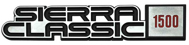
It’s not terrible, but to me it’s not great either, not something I’d use on a superior, muy macho machine like a mid-80s C/K-series pickup.
That said, I really, really like my mid-80s GMC pickup, and thus I can easily overlook the badging as it’s outweighed by the overall awesomeness of the truck.
Same energy here.
Of course, I have no formal graphic design experience or training, so the possibility exists that I don’t know what the hell I’m talking about.
Personally I’ve never been too bothered about logos and similar branding, I’m far more concerned with what’s under the covers. There are some garishly obvious exceptions to that but for the most part I barely notice logos. And I really don’t care too much about this one.
To be honest I’m much the same on bass aesthetics. Yes some are too horrible to contemplate, but I’ll live with most any aesthetic if the bass, sounds good and plays well and comfortably.
As much as we loved the old logo it had minimal consideration for actual usage and its need to fit in with the main website refresh https://www.bassbuzz.com/
The hand+bolt, cool AF agreed. But it ate way too much vertical space. Sure you could squeeze it in on the main site …but then you’d have a teeny tiny lettering a weird white (black) space.
Ditto the width, we tried the unsquashed logo on the main site – it was just calling too much attention to itself and knocking the overall page balance off. And, we tried colours (orange bolt, of course), fonts, spacing, hands no hands, the whole shebang.
Actually, we’re due to revise the “above the fold” design of the main website soon to condense the header areas down some, that might usher in logo tweaks (you B2B users might have noticed a more refined less bloated header area in the lesons area, by comparison).
In any case, comments noted and appreciated. Some of the comments are not unreasonable.
And if it’s not until we refresh the design in 5 or so years design we’ll find try and find a design that you all don’t hate
Thanks all
PS. The forum logo shouldn’t be fuzzy. We’ll get that sorted, I think it’s item #267 on the list of things that needs doing
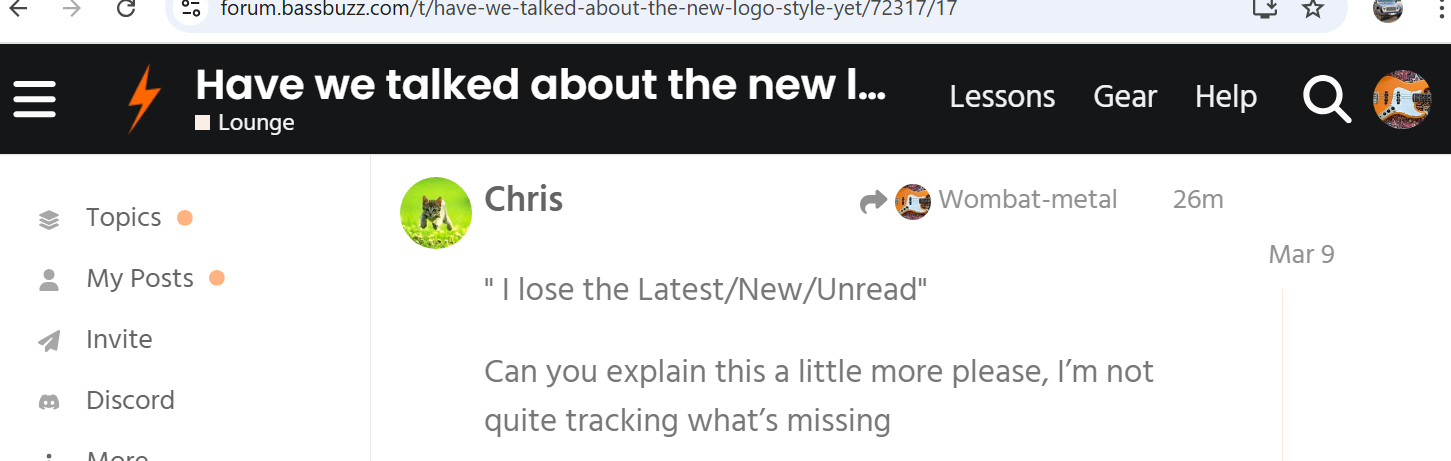
Logo isn’t great, but what I hate about the new design is I lose my navigation bar at the top. I go into a topic, and I lose the Latest/New/Unread navigation at the top.
I know squashing bugs and hearing users bitch is a pain in the ass. I grit my teeth when clients whine to me about what they don’t love about my site designs. But this is the life we chose.
That said, yeah, I don’t dig the logo refresh. It just doesn’t do it, graphically, IMO.
BTW if there’s any other janky forum things (other than the ruddy logo ) please ping em here and we’ll see what we can do. I can see the old girl does need a clean up here and there.