Whoa, Chris, good to see you back here… it’s been a loooooong time
I didn’t mean to incite “hate” against the new logo; it was more of a head-scratching thing and wondering whether others had noticed the same and had any thoughts on it
Haha, yes, no problem. I do think most people in here always tend to be reasonable and, again, there was any trolling (or shaming) involved… (well… maybe a teeny tiny bit )
Not sure if this is in your remit, but since you asked …
My avatar doesn’t seem to be properly synced between the lessons and forum. I set my avatar here, but when I go to lessons and am prompted to log in there (to leave a comment etc), it automatically switches to my google gravatar.
When I come back to the forum, I have to re-upload my usual avatar again.
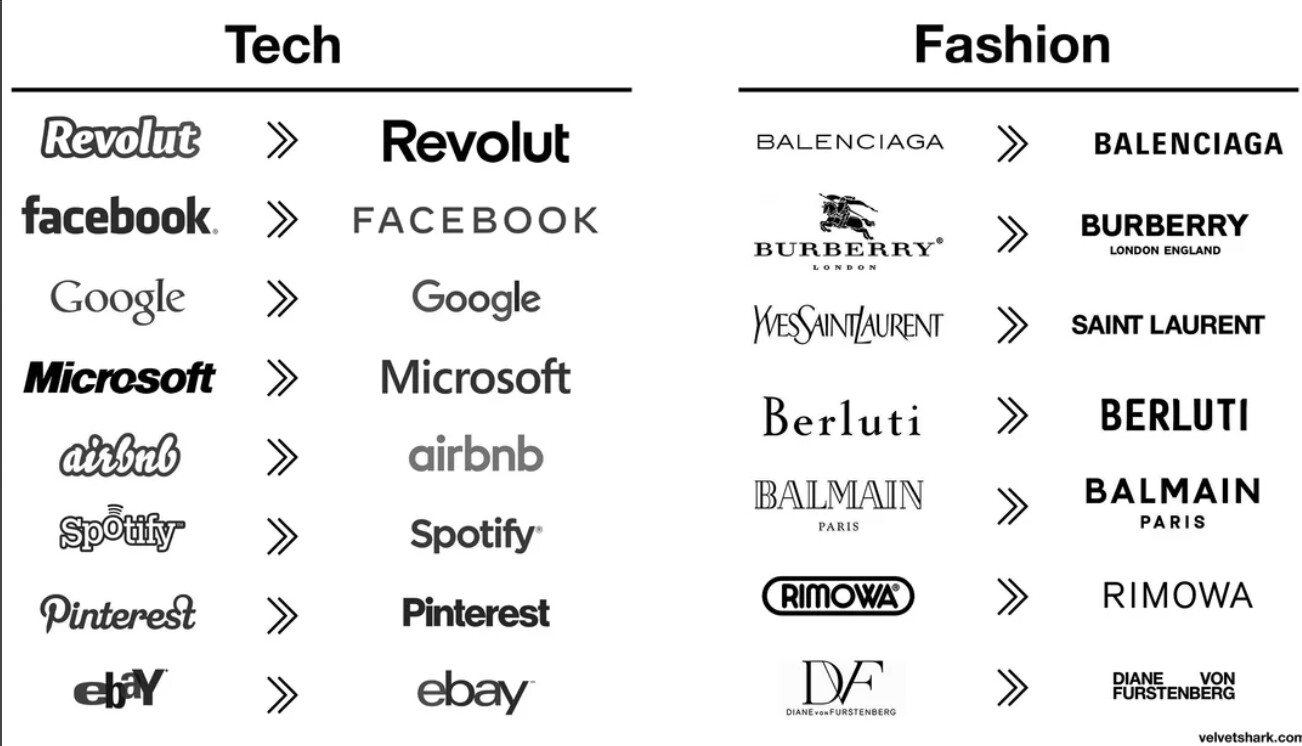
Yeah, web means scalability and readability but I can’t help feeling sad when I see stuff like the below. I understand why it happens, but still.
(Ok some of those tech logos were ugly. I just have a soft spot for the early, exploratory, ugly geocities days ). OH NO - I see Ling’s cars even had a makeover now!!! That was an eye-bleeding gem.
Yes that’s my point, it works in some cases so someone probably did something wrong and didn’t check their work. Maybe they didn’t us fluid images and that’s why the resolution is poor in some cases. Usually it’s portrait that works and not landscape
Web design is a complete discipline. Web development is another. The two need to unite as much as possible to create a seamless user experience.
This is easy to think, say, and wish for, but it isn’t easy to achieve.
Without universally accepted standards and regulations among browsers and devices, it takes a LOT of work for designers and developers to force the Wild West Web to do what you want it to.
I founded and ran a creative agency that employed really talented designers and developers. As creative director, I would interview the client to conceive the overall site messaging, look, and feel. My designers would expand on the concept, and my developers would work their tech fu like fiends to make everything a reality. The process wasn’t pretty, but, hopefully, the final product was attractive and, most importantly, effective and useful for the client.
Same for car design. Decades ago, Ford body designers and engine designers failed to talk to each other when developing a new 2-door model with the 390/396 (can’t remember Ford from Chevy) engine. You had to pull the engine to get at the 8th spark plug (back one on the driver’s side). Lots of those engines ran really crappy. Tune-ups at the dealer were stupid expensive, and home mechanics couldn’t get at it, so it never got replaced at tune-up time.
There are lots of things like that in cars, sometimes you can only reach something by putting it up on a hoist and reaching over the top of the transmission with a 5 ft long extension At least one car with the Buick 231, you have to unbolt the torque strap and rotate the engine forward to reach the back bank of spark plugs.
I had to remove the oil filter adapter on my jeep Cherokee to replace the oring, the bolt is about 3/4in from the frame so you can’t fit a ratchet in there… I had to cut a torx socket and weld it to a flat bar to loosen the bolt Dodge minivan you (technically) have to drop the engine to remove the water pump. There were several vehicles you couldn’t easily replace the blower motor so people cut through the inner fender to access it.
Cars aren’t designed for maintenance, they’re designed for assembly.
BTW, apparently we do have a version on the new logo with a sexy bass (as per above not used in the site design cos of awkward dimensions and white space issues). It’s not uncommon to have multiple versions of the same logo for different use cases.
@JoshFossgreen does not allow anyone permission to use his company’s logo for any purpose. It is his intellectual property, and not in the public domain.